01
The mark
An O and an A that lean on each other. It is the only logo. Next to it, my name is set in the display face, never drawn as a logo of its own.
Room to breathe
Keep clear space of half the mark's height on every side. Nothing else (text, edges, other logos) comes inside the dashed line.
Sizes
Smallest is 16 pixels tall on screen and 6 mm in print. Below that it stops reading as two letters.
Leave it alone
02
Color
A chalk page, ink text, and one loud accent. Three soft tints do the section work. The whole site is light; there are no dark pages. Tap a color to copy it.
Poppy has three jobs
Bright poppy only passes contrast at large sizes, so small text and buttons use darker versions of it.
| Pair | Contrast | Use it for |
|---|---|---|
| Aa | 16.5 : 1 | Everything |
| Aa | 8.1 : 1 | Captions and secondary text |
| Aa | 3.4 : 1 | Poppy #EF4A24: type 24px and up, shapes, the full stop |
| Aa | 6.1 : 1 | Poppy text #B02A10: small labels and links |
| Aa | 4.7 : 1 | Poppy fill #D63A12: buttons with white text |
| Aa | 4.8 : 1 | Ink on bright poppy |
| Aa Aa Aa | 12.8 to 13.6 : 1 | Ink on any tint |
03
Type
Two families, both free on Google Fonts. Archivo, stretched wide and set in capitals, does the shouting. Instrument Sans does the talking.
Display
Aa Rr
Archivo, width 125% (Expanded), weight 400, all capitals, tracking −3.5%, line height 0.8 to 1. Headlines, giant words, section titles, the name.
Text
Aa Rr
Instrument Sans, weight 400 (500 for emphasis), sentence case, line height 1.5. Body, buttons, labels, captions, forms.
72 to 240pxHello
38 to 84pxMake it travel
24 to 40pxHow I work
20 to 30pxI take the work nobody can read and make it travel.
16 to 20pxStrategy, writing, and film for people with something complicated to say. Based in Amsterdam.
15pxSelected work
14pxPhoto: Amsterdam, spring 2024.
House rules
- No italics in either face. Emphasis is weight 500 or the sky highlighter, once or twice a paragraph at most.
- Display type is always capitals. Text type is always sentence case, buttons included.
- Headlines balance across lines. Paragraphs stay under 60 characters wide.
- Japanese text falls back to Noto Sans JP.
04
Layout
Twelve columns, a narrow gap, generous air between sections, and hairlines in place of boxes.
- One hero object per screen, big type, few labels.
- Photos and video sections are never tinted, filtered or covered with a scrim.
- Corners stay square, except pills and circles.
- On phones everything stacks into one column; nothing scrolls sideways.
05
Pieces
The small parts that repeat everywhere.
Buttons are pills
One poppy button per screen, for the main thing. Labels say exactly what happens, in sentence case. The wit goes in the sentence beside the button.
Colored panels
Steps and sections cycle sky, blush, lilac, poppy, always with ink text.
Labels and links
Kicker label
Links in running text are underlined in ink; navigation links draw their underline in on hover.
06
Paper Route
The site's one idea: work that leaves the desk and goes somewhere. It keeps two signatures and one moving object, and nothing else gets added on top.
Cut paper
Flat shapes with a slight lift. The poppy circle is the full stop of the OA mark grown up.
The stamp book
Ink line drawings, one per page, like stamps in a passport.
The paper plane
The only thing that flies: across the map, and off the Send button.
Stamps in use





07
Voice
Short sentences, plain words, dry over warm. The joke is on me, never on the client or the reader.
I now schedule everything for Monday at 9:10. The life is a work in progress.
How it works
- If a short word and a long word mean the same thing, the short one wins.
- Warmth arrives through facts, never through adjectives.
- At most one wry sentence per paragraph, usually the last.
- Specifics carry the comedy. "Monday at 9:10" is funny. "Early in the week" is not.
- Nothing ends on a moral. End on a fact, an image, or a small admission.
- Lists have three items only when there were three things.
- Say what is true. Skip the setup of what is false.
- American English, Oxford comma, no em dashes or en dashes.
Swaps
| Instead of | Write |
|---|---|
| We leverage cutting-edge AI to unlock your team's potential. | I set up the assistants with the people who'll use them. |
| Submit | Send it |
| Our innovative, comprehensive approach fosters meaningful change. | One workflow goes live in the first weeks, measured against how it ran before. |
| Passionate storyteller and strategist. | Director, producer, writer, photographer, and editor. |
Sounds like me
Hillary Clinton was in town for an honorary degree and I told her I'd be Secretary of State. Neither of us has followed up.
Either the link has a typo or I moved the page and forgot to leave a forwarding address.
08
Never
09
Files
The mark and the lockup in ink, chalk, white and poppy, as SVG and transparent PNG, plus square icons and a favicon. One zip, 0.8 MB.
Download the logo kitThe mark as SVG. It picks up whatever text color it sits in.
Download the mark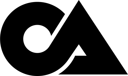
Every color, size, and spacing value as CSS variables.
Download the tokensBoth families are free on Google Fonts.